Palettailor: Discriminable Colorization for Categorical Data
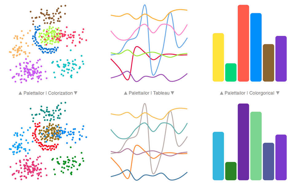
Kecheng Lu, Mi Feng, Xin Chen, Michael Sedlmair, Oliver Deussen, Dani Lischinski, Zhanglin Cheng, Yunhai WangFigure 1 Results for different types of categorical data visualizations: (left) palettailor- versus Colorization [6]; (center) palettailor- versus Tableau [30]; (right) palettailor- versus Colorgorical [10]. Our system integrates the creation and the assignment of colours to a visualization in a data-aware manner.
Abstract
We present an integrated approach for creating and assigning color palettes to different visualizations such as multi-class scatterplots, line, and bar charts. While other methods separate the creation of colors from their assignment, our approach takes data characteristics into account to produce color palettes, which are then assigned in a way that fosters better visual discrimination of classes. To do so, we use a customized optimization based on simulated annealing to maximize the combination of three carefully designed color scoring functions: point distinctness, name difference, and color discrimination. We compare our approach to state-ofthe- art palettes with a controlled user study for scatterplots and line charts, furthermore we performed a case study. Our results show that palettailor-, as a fully-automated approach, generates color palettes with a higher discrimination quality than existing approaches. The efficiency of our optimization allows us also to incorporate user modifications into the color selection process.
Materials
Paper: [PDF 8.07M]. Supp: [PDF 12.2M].
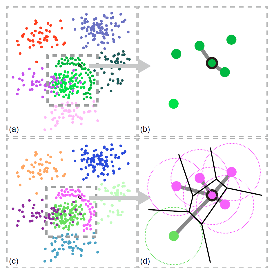
Figure 2 Comparison of nearest neighbors definitions in KNN graphs and α-Shape graphs. (a) Results generated by a KNN graph using only point distinctness: the generated colors are hard to discriminate; (b) Nearest neighbors of the selected point in the KNN graph; (c) Results generated by α-Shape graph only using point distinctness: the generated colors are easily to discriminate; (d) Nearest neighbors of the selected point in the α-Shape graph.
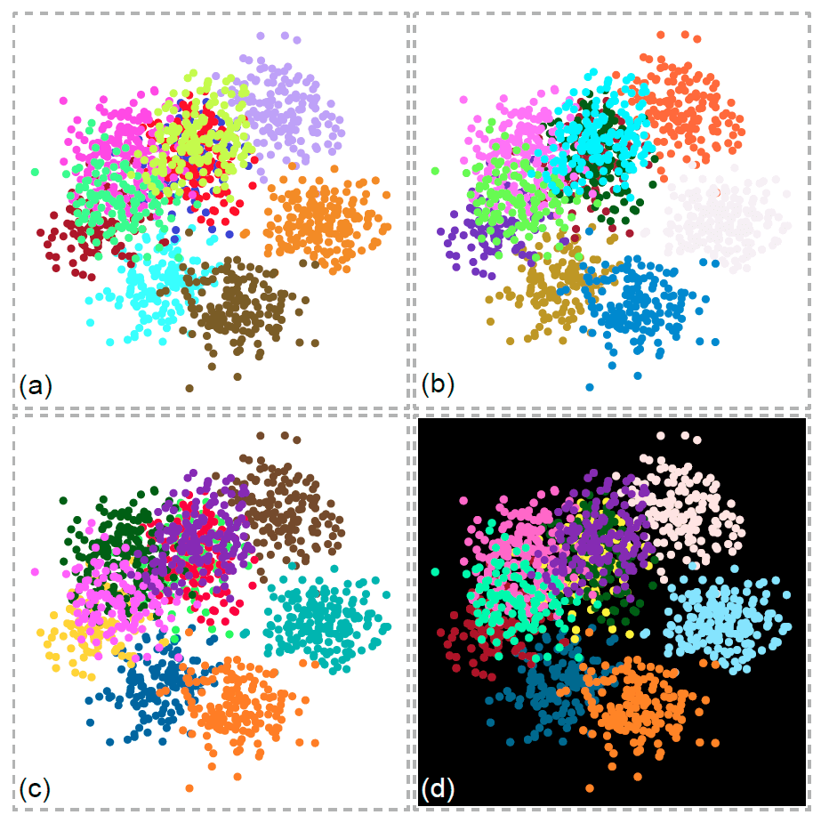
Figure 3 Colorization results based on different optimization criteria: (a) without Class Discrimination constraint; (b) without considering background color making it hard to see points of one class; (c) integrating the white background into the optimization lets the class appear in a dark color; (d) integrating the black background color into the optimization changes the colorization of many classes in order to create the necessary contrast.
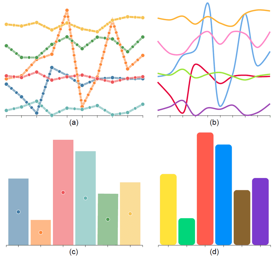
Figure 4 Converting line and bar charts to point-based representation for colorizing them: (a) each curve in a line chart is discretized into equidistant points; (b) colorized line chart; (c) for a bar chart, the center of each bar is represented as a point and connected to its two adjacent bars for forming the graph; (d) colorized bar chart.
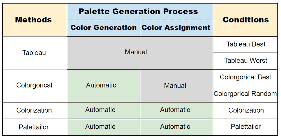
Figure 6 On the left column we show the existing methods that generate color palettes for visualizations including Tableau [30], Colorgorical [10] and Colorization [6], together with our proposed method palettailor-. These methods adopt different palette generation processes that have different levels of automation (shown in the middle columns). For example, Colorgorical’s process involves automatic color palette generation and manual color assignment, meaning that it needs manual effort to assign the colors from the palette to the visualization.
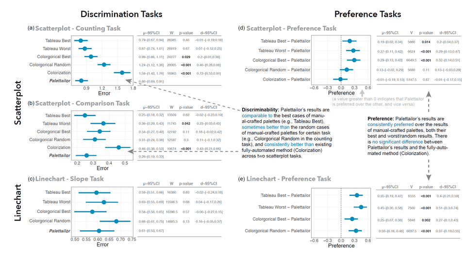
Figure 7 Results for scatterplot and line chart experiments: For each task (e.g., the counting task in the scatterplot experiment, marked as Scatterplot - Counting Task), we give a confidence interval plot and a statistic table. In the table, for each condition we provide the statistics including the mean with 95% confidence intedrval (μ ~95%CI), the W-value and p-value from the Mann-Whitney test, and the effect size (d ~95%CI). For the discrimination tasks on the left, we conducted statistical tests to compare palettailor- to every other condition, and provide W or V values, p-value and effect size (d ~95%CI) accordingly in the tables.
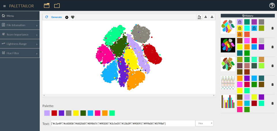
Figure 8 A screenshot of our interactive system. Users can load different datasets and generate suitable color palettes. If they are satisfied with a result, they can download the image or export the palette definition to use in their own system. We also offer a history for users to find their previous results.
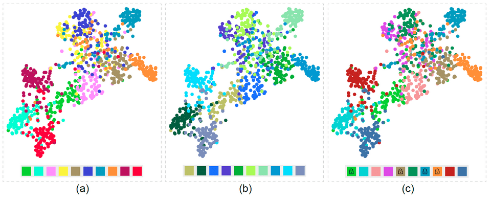
Figure 9 CIFAR10 dataset: (a) Palette generated by default setting; (b) User-specified Hue Filter with “green” and “blue”; (c) After clicking on colors to lock them, our system completes the palette automatically.
Acknowledgement
This work is supported by the grants of the NSFC (61772315, 61861136012), the Open Project Program of State Key Laboratory of Virtual Reality Technology and Systems, Beihang University (No.VRLAB2020C08), the CAS grant (GJHZ1862) and Deutsche Forschungsgemeinschaft (DFG) – Project-IDs DE 620/26-1, as well as 251654672 – TRR 161 Quantitative methods for visual computing.
